In The Spirit Of Rave.ca
| Good [+1]Toggle ReplyLink» El_Presidente replied on Mon Mar 23, 2009 @ 8:59pm |
bahaha totally didnt see that. SUE SUE SUE!!!1111 | |
| I'm feeling tipsy for prez 2009 right now.. | |
| Good [+1]Toggle ReplyLink» Mico replied on Mon Mar 23, 2009 @ 9:01pm |
How did you miss that!? I couldn't believe it was even there. | |
| I'm feeling cool right now.. | |
| Good [+1]Toggle ReplyLink» Nuclear replied on Mon Mar 23, 2009 @ 9:09pm |
keep the name of the party on the back... you don't want to end up with people calling your party mainfloor or something like that...
maybe the title should go up and down... makes the name larger... thats for the front... it's nice though... hard to do bad... | |
| I'm feeling nuclear right now.. | |
| Good [+1]Toggle ReplyLink» AlienZeD replied on Tue Mar 24, 2009 @ 12:07am |
Originally Posted By STRIK_IX
I know, but the two corniest ones at least to me are Twirl and Lens Flare. Also, the appearance on the back of the flyer of the flying pineapple vagina eye that spawned controversy made me laugh. controversy? that's sweet! and I'll try the lens flare like you suggested! | |
| I'm feeling will dj for money right now.. | |
| Good [+1]Toggle ReplyLink» Samwise replied on Tue Mar 24, 2009 @ 1:05am |
Originally Posted By STRIK_IX
Here's a tip: Twirl filter makes baby jesus cry. not if used wisely...  | |
| I'm feeling poutinecore!! right now.. | |
| Good [+1]Toggle ReplyLink» Vegan replied on Tue Mar 24, 2009 @ 1:16am |
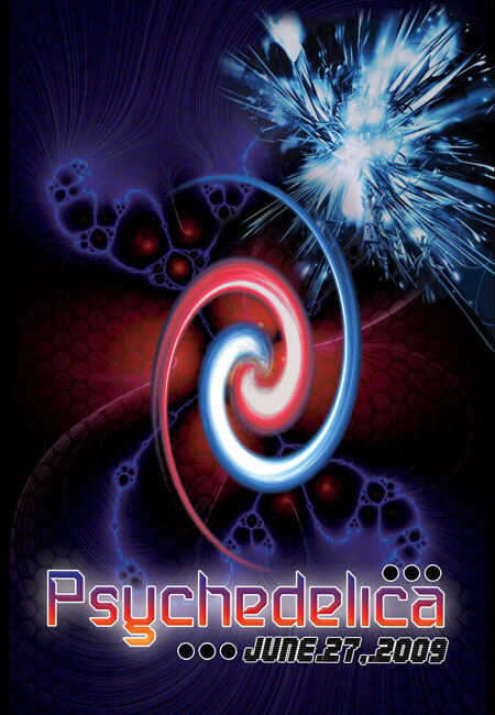
Update » Vegan wrote on Tue Mar 24, 2009 @ 1:39am The first one I quoted from u is by far my favorite. Please keep the font for the DJ's, it's awesome, and I like it with the bright background as opposed to the greyed out one that was posted later. I'd like to see less glow on the "Psychedelica" font, and change the middle column font to match the font of "from the producers of Girls...." or simelar, if you decide to chance that font too. Change the fond of "AV Deco..." to match also... [ ] and "featuring" should also match one of your main fonts, I think.
But everything else IMO is fucking epic. It's like looking in "trancer's guide" and feeling like I'm at a party just by looking at all the cool little thumbnails. seriously, the one with the swirl behind it, that is not faded out - that one is awesome. Update » Vegan wrote on Tue Mar 24, 2009 @ 1:41am I know it's been said but taking off the fadey black border was a good idea too. It will look ridiculous with bleed. | |
| I'm feeling no cancer right now.. | |
| Good [+1]Toggle ReplyLink» JasonBeastly replied on Tue Mar 24, 2009 @ 1:05pm |
God damn it man, why does everything psy look like some kind of technicolor vomit? | |
| I'm feeling rave.ca an hero right now.. | |
| Good [+1]Toggle ReplyLink» AlienZeD replied on Tue Mar 24, 2009 @ 1:16pm |
because after too much acid that's exactly what happens! | |
| I'm feeling will dj for money right now.. | |
| Good [+1]Toggle ReplyLink» JasonBeastly replied on Tue Mar 24, 2009 @ 1:50pm |
I dunno man, it depends what you're looking at to begin with. Set, Setting, Dose, right? Thing that started bugging me about psy trance parties a long time ago was that I felt like I'd always be walking into the same fucked up sensory overload trip with the same colours and the same style of music... after a while, you know, I wasn't getting any new revelations! I was just on some broken record trip.
Now I trip and I have to deal with utterly complex shit that goes above and beyond wondering if people are reptiles or if I should actually wear only clothing that glows under blacklights. I finally started to grok fullness and understand the complexity of life without buying into hive-minded brainwashing. Beware the psy trance trap. You are all at risk of hypnotizing yourselves to be a bunch of paranoid colourful smelly freaks who think that you somehow have a way to save yourself from all the aliens who don't dig your music because they're possessed. You know who else thinks we're infected with alien genes? The scientologists. | |
| I'm feeling rave.ca an hero right now.. | |
| Good [+1]Toggle ReplyLink» AlienZeD replied on Tue Mar 24, 2009 @ 4:06pm |
Originally Posted By LUKEPERIL
I dunno man, it depends what you're looking at to begin with. Set, Setting, Dose, right? Thing that started bugging me about psy trance parties a long time ago was that I felt like I'd always be walking into the same fucked up sensory overload trip with the same colours and the same style of music... after a while, you know, I wasn't getting any new revelations! I was just on some broken record trip. Now I trip and I have to deal with utterly complex shit that goes above and beyond wondering if people are reptiles or if I should actually wear only clothing that glows under blacklights. I finally started to grok fullness and understand the complexity of life without buying into hive-minded brainwashing. Beware the psy trance trap. You are all at risk of hypnotizing yourselves to be a bunch of paranoid colourful smelly freaks who think that you somehow have a way to save yourself from all the aliens who don't dig your music because they're possessed. You know who else thinks we're infected with alien genes? The scientologists. That's pretty extreme stereotyping. Although some of it has the scent of 'true' It's hardly the case for everyone. I'm not much of a raver myself, I only go to the good parties (or ones I spin at of course) and my world views could be seen as quite anti-hippie or anti-psytrance depending on what you define those to be. In any case, I started throwing parties for three reasons: 1. to show people that I can mix up a storm at peak hours 2. because complaining that parties don't suit you is stupid. Shut up and throw your own parties 3. to breathe life into a scene that needs it, psychedelic lifestyles were growing stagnant.... I can count the decent promoters in this city on one hand. I have some major cool ideas for this year's Psychedelica, things that will actually be innovative and new. I'm going to bring the best of everything we've come to love and take cues from other scenes and bring in new ideas, new concepts, new new new! Is it going to be a mostly psytrance party? Yes. Do I want people to know that by looking at the flyer? Yes. Is Creature Productions doing the same old shit? No, at least with any luck, I'll be bringing quality and innovation back into the rave scene and then boost it up with games, contests, new music and more! Killer sound, awesome deco and great DJs are all things every promoter should live by. Bringing something new to the scene is impossible if your head is stuck up the ass of a stereotype. And my head is far from up anyone's ass. Fuck you goatse! seems like we've come full circle :\ | |
| I'm feeling will dj for money right now.. | |
| Good [+1]Toggle ReplyLink» rawali replied on Tue Mar 24, 2009 @ 4:14pm |
Originally Posted By ALIENZED
Although some of it has the scent of 'true' is that what you call the foul smell that infects psy raves? | |
| I'm feeling lovely right now.. | |
| Good [+1]Toggle ReplyLink» AlienZeD replied on Tue Mar 24, 2009 @ 11:41pm |
| Good [+1]Toggle ReplyLink» Nathan replied on Tue Mar 24, 2009 @ 11:47pm |
| Good [+1]Toggle ReplyLink» nothingnopenope replied on Wed Mar 25, 2009 @ 1:14am |
patchouli is very overused. I have bergomont, ylang-ylang, lavender, frankincense, and eucalyptus oils and I can make many different blends of oils that are 10x better than the shit quality patchouli they sell at most head shops. I don't understand why people buy that stuff. | |
| I'm feeling meow right now.. | |
| Good [+1]Toggle ReplyLink» rawali replied on Wed Mar 25, 2009 @ 1:30am |
| Good [+1]Toggle ReplyLink» AlienZeD replied on Wed Mar 25, 2009 @ 3:08am |
nah I appreciate your comments totally man! I like the colors of the DJ names but i'll be reworking the column layout. I am just worried that everything will be too small if I force it into a smaller space.
Other thing is that with this font, the 'I' disapears when the tracking is too extreme, which is why psycronik and psydraulix are smaller... you think I should make them ALL smaller to make it work? at least then it'd be consistent. 
a few fix ups from your comment. I don't 'want' to tone down the colors at all, I mean, I want something that stands out over all the trendy and oh so boring flyers out there. Most flyers these days just try too hard to be 'cool'. Psytrance people aren't cool, we don't give a fuck about labels, and doesn't that truly make us cool? no? ah well, s'all good. Update » AlienZeD wrote on Wed Mar 25, 2009 @ 3:12am the only thing really that I see goes against your comments are colors and the part where it says "venue tba 24h in advance"
notice the word psydraulix though, it's tuff to make out the last three letters... | |
| I'm feeling will dj for money right now.. | |
| Good [+1]Toggle ReplyLink» nothingnopenope replied on Wed Mar 25, 2009 @ 3:30am |
I find it is hard to pull off 'psychedelic' well and not have things seem jumbled together. This is the case where you hire an artist who can pull it off, because getting the right balance is very difficult. You'd need an expert in colour theory with years of experience to pull off a balanced psy flyer that still retained the trademark 'rainbow on crack' look. | |
| I'm feeling meow right now.. | |
| Good [+1]Toggle ReplyLink» rawali replied on Wed Mar 25, 2009 @ 3:56am |
that is soooooooo much better mate! for the colors, i understand your choice, thats a question of personal taste more than of design efficiency...
i have to agree though that psydraulix is a bit hard to read, what you could do to fix that if you dont want to size down all the dj names is use a bit of kerning... reduce the space between the s and the y, the y and the d, the r and the a and add space between the u and the l... basically just redistribute spacing where it is most crucial... good work though, now i can look at this flyer and not cringe! ;) hehe | |
| I'm feeling lovely right now.. | |
| Good [+1]Toggle ReplyLink» AlienZeD replied on Wed Mar 25, 2009 @ 12:09pm |
excellent idea! again, thanx for all the tips. I really really appreciate it :D | |
| I'm feeling will dj for money right now.. | |
| Good [+1]Toggle ReplyLink» JasonBeastly replied on Wed Mar 25, 2009 @ 12:17pm |
I dunno man, I don't remember Patchouli smelling like buttsweat and moldy dreads. | |
| I'm feeling rave.ca an hero right now.. | |
In The Spirit Of Rave.ca
[ Top Of Page ] |
Post A Reply |
You must be logged in to post a reply.
[ Top Of Page ] |

